What color are warning signs
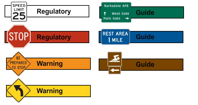
When navigating through the complexities of everyday life, we often encounter signs that serve as visual cues, providing us with crucial information and guidance. Among these signs, warning signs stand out, instantly commanding our attention with their distinctive appearance. But what exactly is the color of a warning sign? The answer lies not just in aesthetics but also in the principles of safety and human perception.
What Color Are Warning Signs? A Global Overview
Warning signs utilize color to immediately grab attention and convey a sense of urgency or danger. While there isn't a single universally enforced standard across all countries and contexts, certain colors are predominantly associated with warnings due to their psychological impact and cultural understanding. Yellow and red are the most commonly used warning colors globally, although specific shades and accompanying symbols can vary.
The Prevalence of Yellow
Yellow is frequently used for warning signs because it's highly visible, especially in daylight. It stands out against most backgrounds and has a strong association with caution and alertness. Yellow is often used to indicate potential hazards that require attention, such as construction zones, pedestrian crossings, and areas with uneven surfaces. The intensity of the yellow can vary depending on the specific regulation and the level of danger it represents. For example, a brighter, more luminous yellow might indicate a more significant risk.
The Power of Red
Red, universally recognized as a color of danger and prohibition, is typically used for immediate hazards requiring immediate action to avoid injury or death. Red signs often indicate absolute prohibitions, such as "Do Not Enter" or "No Smoking." The color's intensity and association with stop signs and emergency vehicles contribute to its effectiveness in conveying a sense of urgency and preventing accidents. The combination of red with other colors, such as white or black, is also common for heightened visibility.
Regional Variations in Warning Sign Colors
While yellow and red dominate warning sign color schemes globally, regional variations exist. Some countries might incorporate other colors like orange or blue for specific types of warnings. These variations are often due to historical conventions, local regulations, or cultural preferences. Understanding these regional differences is crucial when traveling or working in different parts of the world, to ensure effective comprehension of warning signs and prevention of accidents.
The Role of Symbols and Text in Warning Signs
Color alone isn't always enough to convey the specific nature of a hazard. Symbols and text are essential components of warning signs. These provide more detailed information and complement the color-coded warnings. Clear, concise language, combined with universally understood symbols, ensures that the message is accurately interpreted regardless of language barriers. The effectiveness of a warning sign depends heavily on the clarity and relevance of the accompanying text and symbols.
Beyond Yellow and Red: Other Colors in Warning Systems
While yellow and red are dominant, other colors occasionally play a role in warning systems. For example, orange is sometimes used to indicate temporary hazards or construction zones, and blue might be used to convey informational warnings. It is important to understand that these uses are not as universally standardized as yellow and red, and their meanings can vary depending on the context and the specific regulatory authority.
| Color | Common Usage | Level of Urgency |
|---|---|---|
| Yellow | Caution, potential hazards | Moderate |
| Red | Danger, immediate hazard, prohibition | High |
| Orange | Temporary hazards, construction | Moderate to High |
| Blue | Information, mandatory instructions | Low |
What is the most common color for warning signs?
The most common color for warning signs globally is yellow. This is because yellow has a high visibility, particularly against a variety of backgrounds. It stands out well in both bright sunlight and low-light conditions, making it easily noticeable from a distance. The use of yellow as a warning color is standardized internationally, in part due to its proven effectiveness in grabbing attention and signaling potential hazards. While variations exist based on the specific location and type of warning (some regions might use slightly different shades or incorporate other colors), yellow remains the dominant and internationally recognized color for warning signs indicating potential danger or caution. This consistency ensures that the message is universally understood, irrespective of language barriers or cultural differences. The high visibility of yellow contributes to significantly reducing accidents and injuries by providing ample time for individuals to react to potential hazards. It's important to note that yellow is usually paired with a black symbol or text for optimal contrast and legibility.
Are there any exceptions to the use of yellow for warning signs?
While yellow is the predominant color for warning signs, there are some exceptions. Certain situations may call for different color schemes to convey specific types of warnings more effectively. For instance, red is frequently used for immediate danger or prohibition signs. Think of "Do Not Enter" signs or signs marking fire exits. These signs demand immediate attention and action, and the intensity of red helps achieve that. Additionally, some signs might incorporate orange to signify temporary hazards, like construction zones, where the danger is temporary and the work is ongoing. These color variations are often dictated by specific safety standards or regulations of a region or industry. The use of other colors besides yellow is typically determined by the specific type of hazard and the level of urgency that needs to be communicated. It’s crucial to remember that while exceptions exist, the widespread use of yellow remains the cornerstone of global warning signage practices for its exceptional visibility and immediate association with caution.
What other colors might be used in conjunction with yellow on warning signs?
While yellow forms the base of most warning signs, it is often used in combination with other colors to enhance clarity and convey specific information. The most common accompanying color is black. Black text or symbols on a yellow background provide excellent contrast, making the message easily readable from a distance, even in bright sunlight. This combination is considered the most effective for maximum visual impact. Other colors might appear in smaller portions, primarily to highlight specific aspects of the warning. For example, some signs might include red borders or markings to emphasize the level of risk or urgency. In some countries, orange is used as a secondary color to denote temporary hazards. However, these are supporting elements; the yellow background remains the primary indicator of a potential hazard or cautionary message. The careful selection of complementary colors ensures the message is readily understood and the appropriate level of alertness is triggered in the observer.
Why is the color choice for warning signs so important?
The color choice for warning signs is critically important because it directly impacts the effectiveness of the warning message. The primary objective of a warning sign is to alert people to potential dangers and prompt a timely response. The color selected plays a crucial role in achieving this objective. Yellow, for example, has been scientifically proven to have high visibility and to effectively capture attention from a distance. Using an ineffective color could result in the message being missed, leading to accidents or injuries. The choice of color also contributes to the universal understanding of the warning, regardless of language or literacy levels. Standardized color conventions ensure that the same message is understood across different cultures and geographic locations. Careful consideration of color psychology and visual perception ensures that warning signs are not only seen, but are also understood and acted upon to mitigate risk effectively. In short, the correct choice of color is a vital element for ensuring that safety protocols are effective.
Deja una respuesta